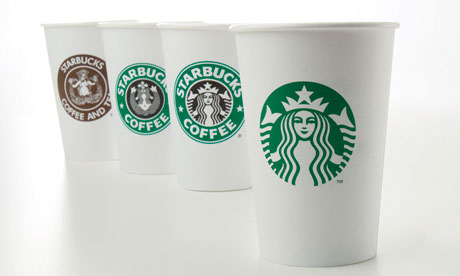
Starbucks recently announced an updating of its seemingly ubiquitous green logo, which features the firm's mermaid "siren" with crown and long flowing hair. No more "Starbucks" name, no more references to "coffee." In fact, no words at all. Getting ready for brand/category extensions again? Trying to break free from its coffee roots?
As Starbucks prepares for its 40th anniversary celebration in March, its newly revised logo has some loyal customers--and some marketers--asking questions.
Although this isn't the first revamp of the logo, some people wonder whether Starbucks is wasting its money on the changeover to the new logo. The Guardian even has a poll asking readers this very question. When I checked today, sentiment was running 2-to-1 against the move. In other words, readers don't agree with Starbucks' investment in its updated logo.
Will Starbucks stay with the new logo or, like the Gap, will it revert to an older version? Let's see how vocal the opposition turns out to be.
skip to main |
skip to sidebar

Companion blog to the textbook by Marian Burk Wood includes links to resources for marketing planning
Updated list of links
About the Author

- Marian B. Wood
- After holding executive positions in corporate and non-profit marketing with Citibank, JPMorgan Chase, and the National Retail Federation, I became a textbook author at the dawn of the Internet age. Pearson Education publishes my college textbook, 'Essential Guide to Marketing Planning.'
Search This Blog
Blog Archive
Privacy Policy
This site uses Google's Blogger technology. Be aware that Google serves cookies to analyse traffic to this blog. If you contact me via my blog, I'll use your email only to respond to your inquiry. Any comments you submit that are posted will be publicly visible. If you click on any links from this blog to outside sites, please review their privacy policies and content. By using this site, you agree to these terms of use.

